Queen City Marcom
Marketing That Moves
Queen City Marcom is a boutique marketing and communications agency based out of Cleveland, Ohio.
The company approached me to help them develop and carry out their needs for a unique, bold, quirky, and engaging brand presence.
Through the development of a redesigned logo and branding identity, creative consulting and art direction of branding identity and website, development of key graphics and animation for website, as well as a branded powerpoint template we came up with a brand presence that was energetic, bold, quirky, and contemporary.
Client Work
Consulting
Art Direction
Creative Direction
Graphic Design
Motion Graphics
Web Design
2017
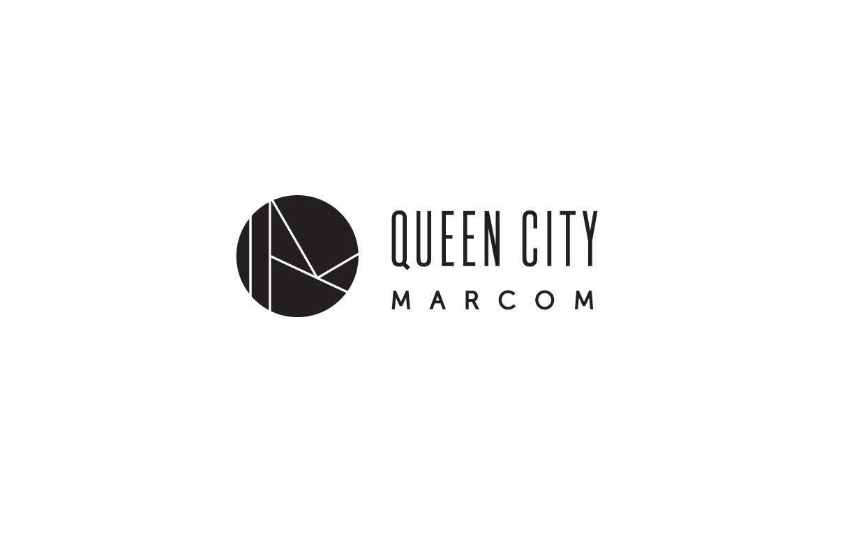
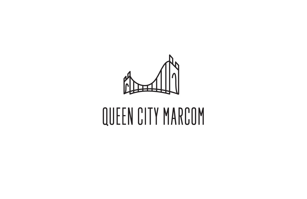
INITIAL LOGO CONCEPTS
Some of the key ideas that were explored when coming up with a new logo mark for Queen City Marcom, was to explore the intersection between the iconic Roebling Bridge, Transportation, Water, Movement, and Energy.
We wanted to create a mark that represented the transportive nature of communications and marketing and how that related to QCM's strong ties to Cleveland, as well as the Roebling Bridge and its iconic symbolism for the city as well as the companies Motto, " Marketing That Moves"; while keeping it fresh, quirky, and contemporary.
Playing a lot with bridges & waves; and creating monograms combining both.

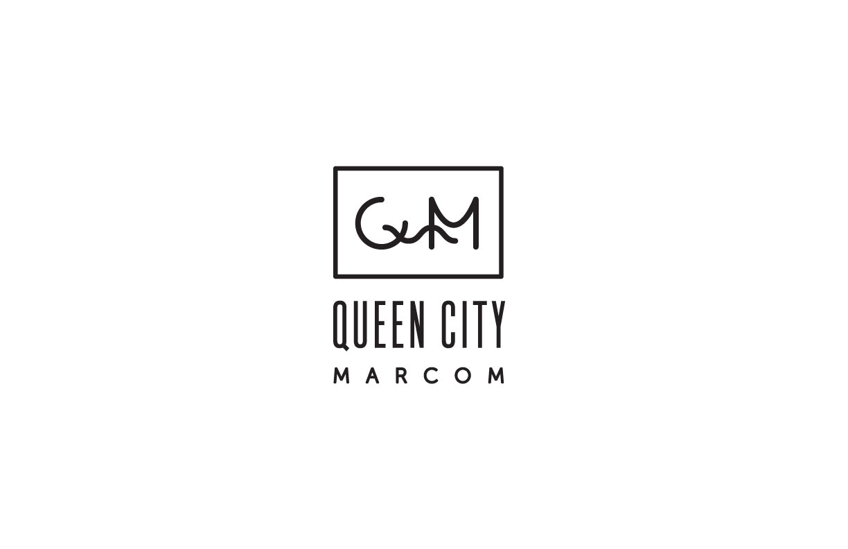
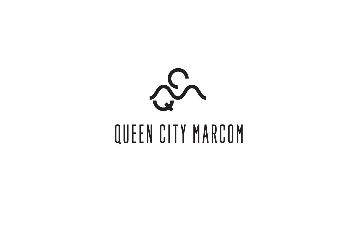
FINAL MARK
Queen City Marcom QCM Wave
The final logo concept is a bold, minimal, quirky, and contemporary take on a monogram.
I used geometric shapes and bold lines to create a flexible and flowing monogram of the letters Q, C, & M.
The M is represented by a wave and stands for marketing and communications. Using a wave as the M, which represents water, motion, and sound, cleverly connects the company with its over arching theme of marketing that moves.
Color Palette
Quirky, Bold, Vibrant, Contemporary, Fresh


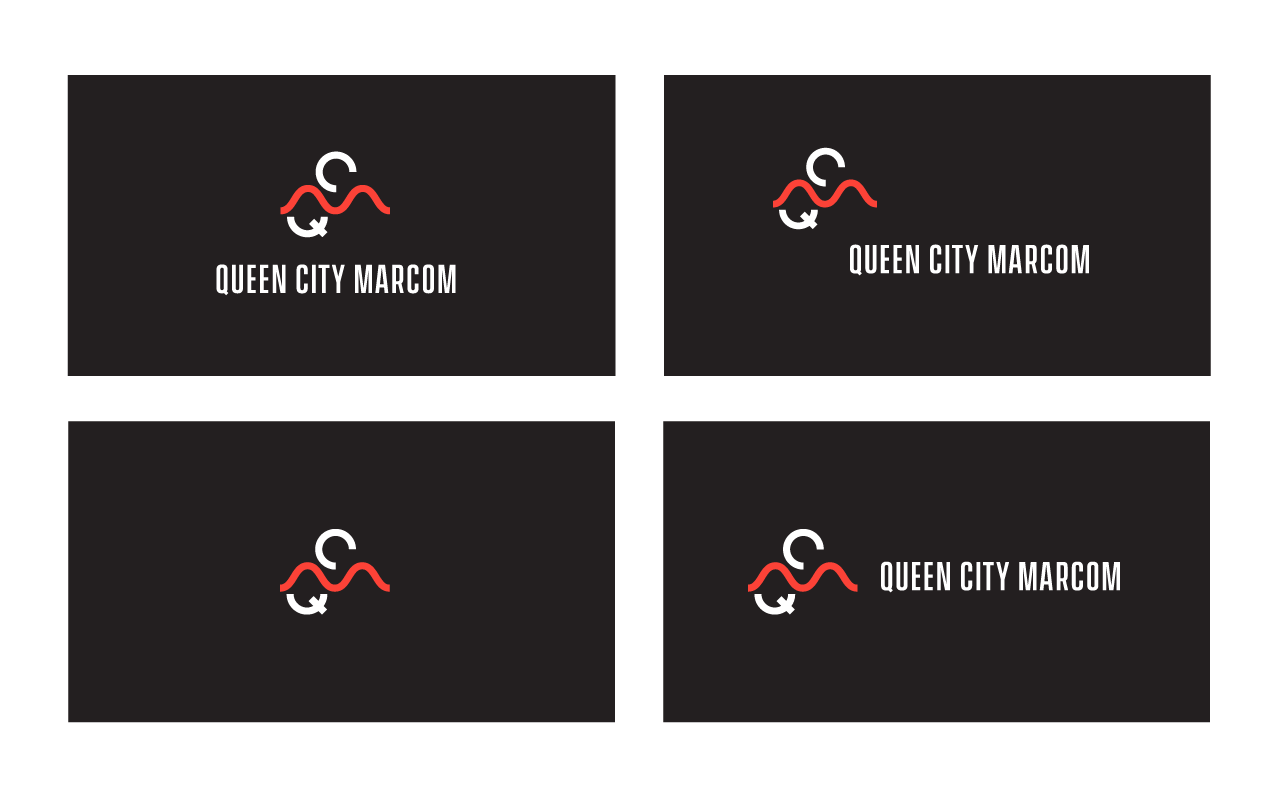
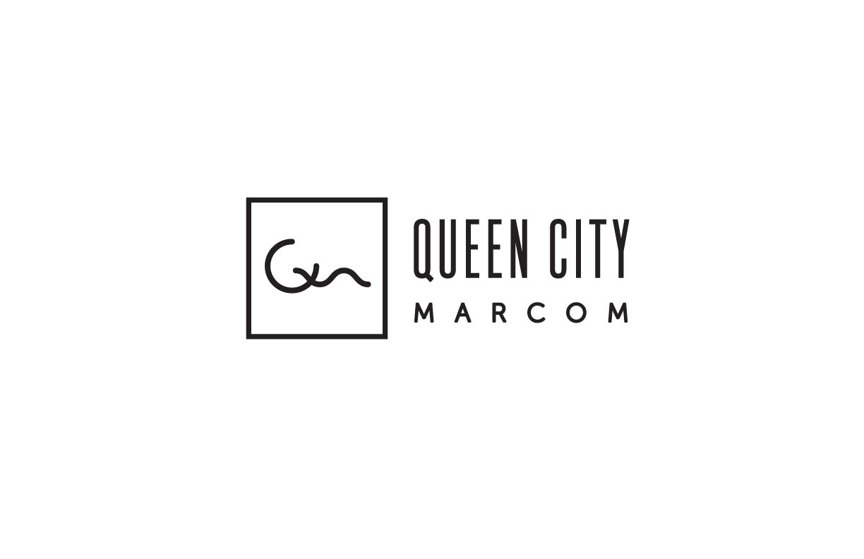
Alternative Versions / Lock-ups
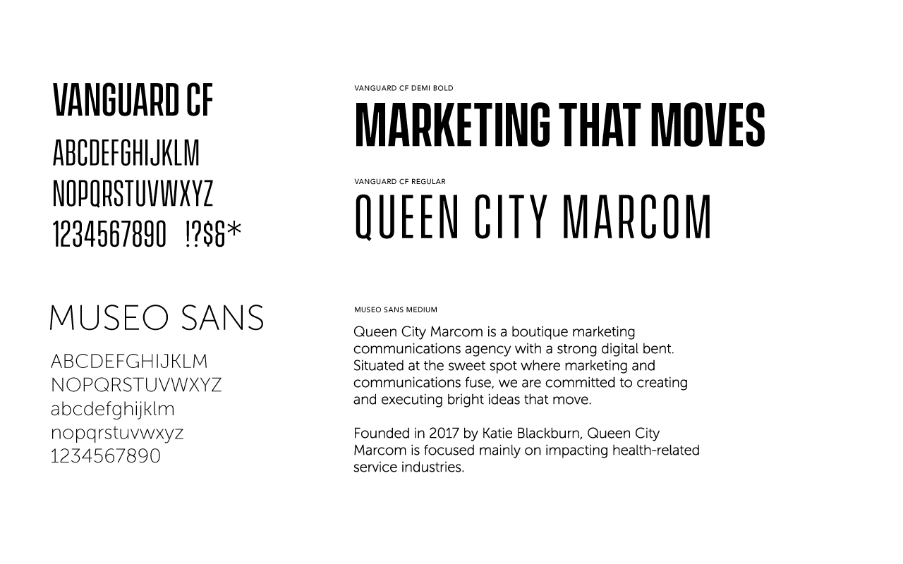
TYPOGRAPHY
Mixing both a tall bold sans-serif with a more humanistic sans-serif to create a dynamic, bold, playful, and contemporary feeling.

WEBSITE SERVICE GRAPHICS
Art Direction & Inspo
QCM wanted dynamic graphics created for their 8 key services.
With their need for a strong playful and quirky feeling; I played around with a standard grid layout and mixed it up to make it more dynamic and engaging, by using photography, layering, and geometric floating shapes/elements to create dynamic visual interest with a sense of quirkiness.


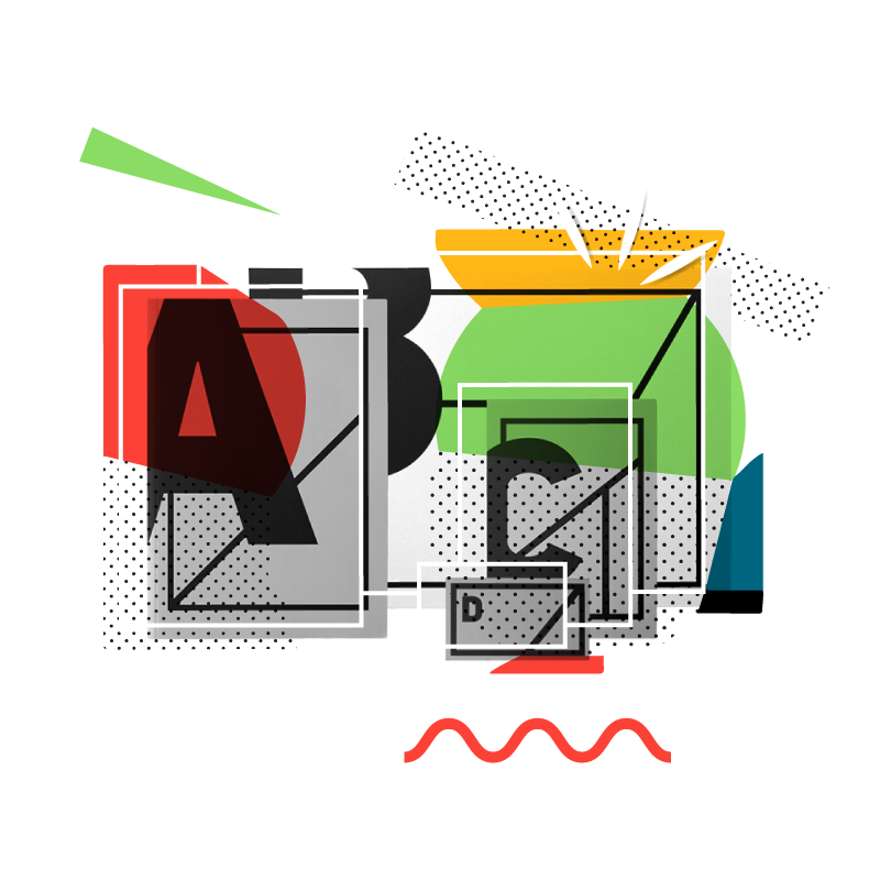
GRAPHICS CONCEPTS
SEO Service Graphics
Utilizing stock imagery, the brands bold color palette, & geometric shapes taken from and inspired by the logo mark to create visual interest and stand alone identifiers for services provided.


FINAL GRAPHICS
OBJECT PHOTOs
Style concept for website graphics utilizing photos of objects that represent in one way or another the services offered
Using B&W photography and the full color palette to create a vibrant, bold, and visually interesting graphic
Wireframed overlay to add dimension and character
Cut out imagery to create a floating effect on screen, instead of contained box
Geometric shapes and patterns as well as organic shapes/strokes for an overall bold, quirky, and colorful feeling


WEBSITE & ANIMATION
CONCEPTS
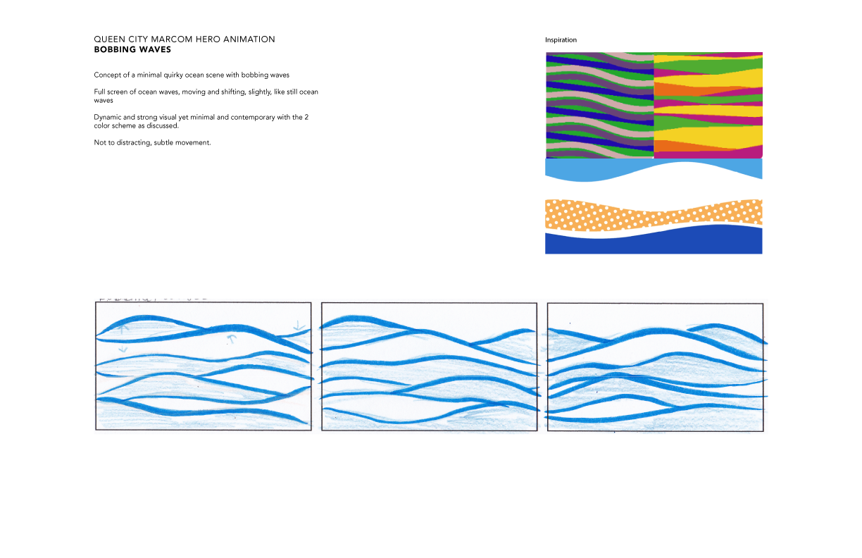
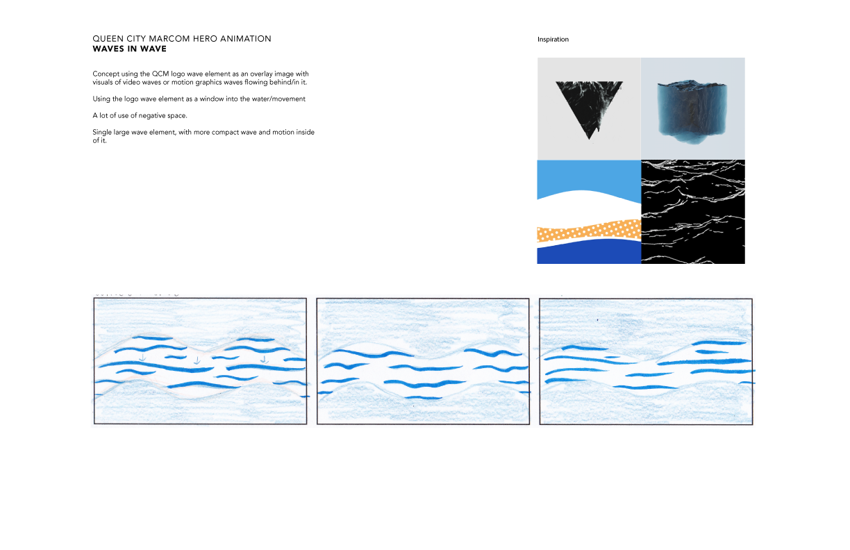
QCM's main motivation for the site was to feature a large hero animation as the main attraction.
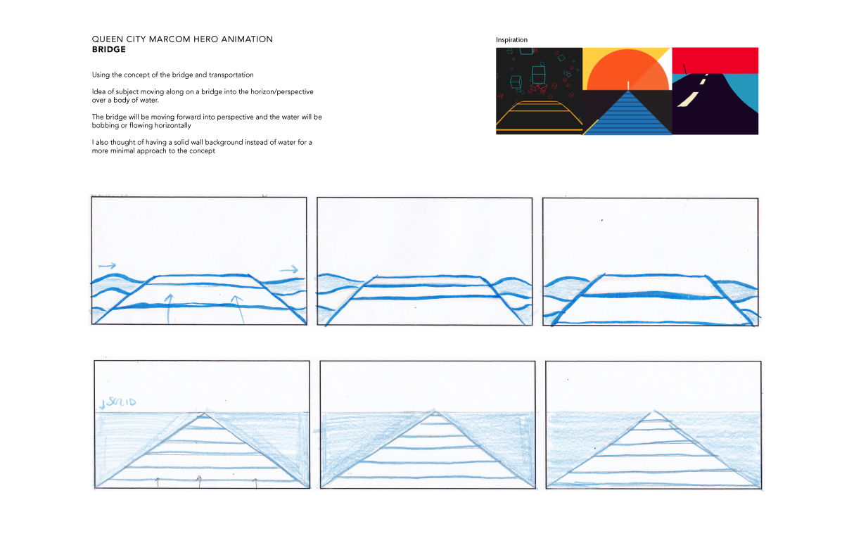
The inspiration for the animation was to create something "moving" and play off the inspo of the Roebling Bridge and create a wave like animation.
Drawing inspo from both the bridge and the companies motto "marketing that moves" I created different animation styles that would add the Fresh, Energetic, Bold, and Moving imagery that the brand was looking for.

FINAL ANIMATION
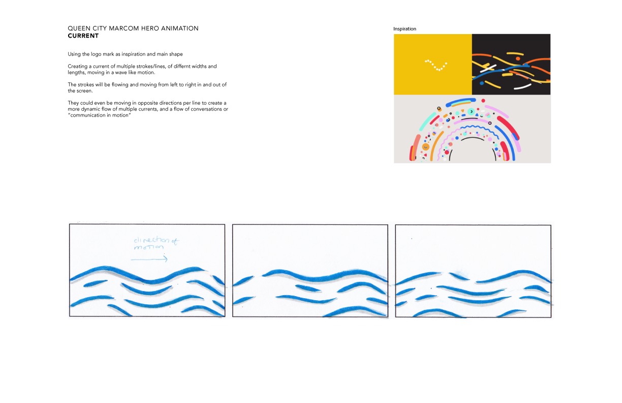
Using the logo mark as inspiration and main shape Creating a current of multiple strokes/lines, of different widths and lengths, moving in a wave like motion.
The strokes will be flowing and moving from left to right in and out of the screen at various speeds; Creating a dynamic flow of multiple currents, and a flow of conversations or “communication in motion.”


WEBSITE DESIGN
Designed a clean and simple parallax website design to support and showcase the vibrant and playful color scheme and graphics.


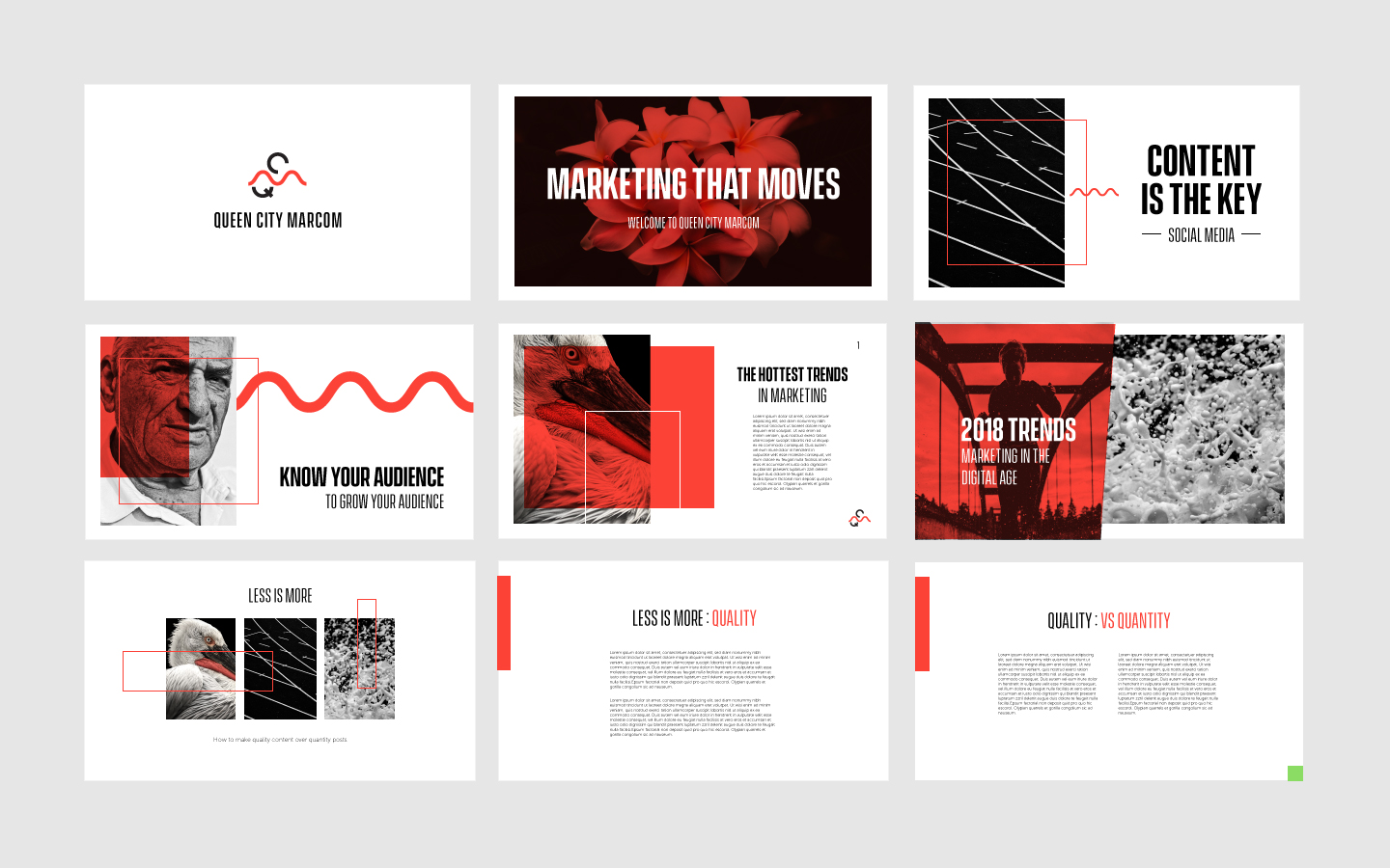
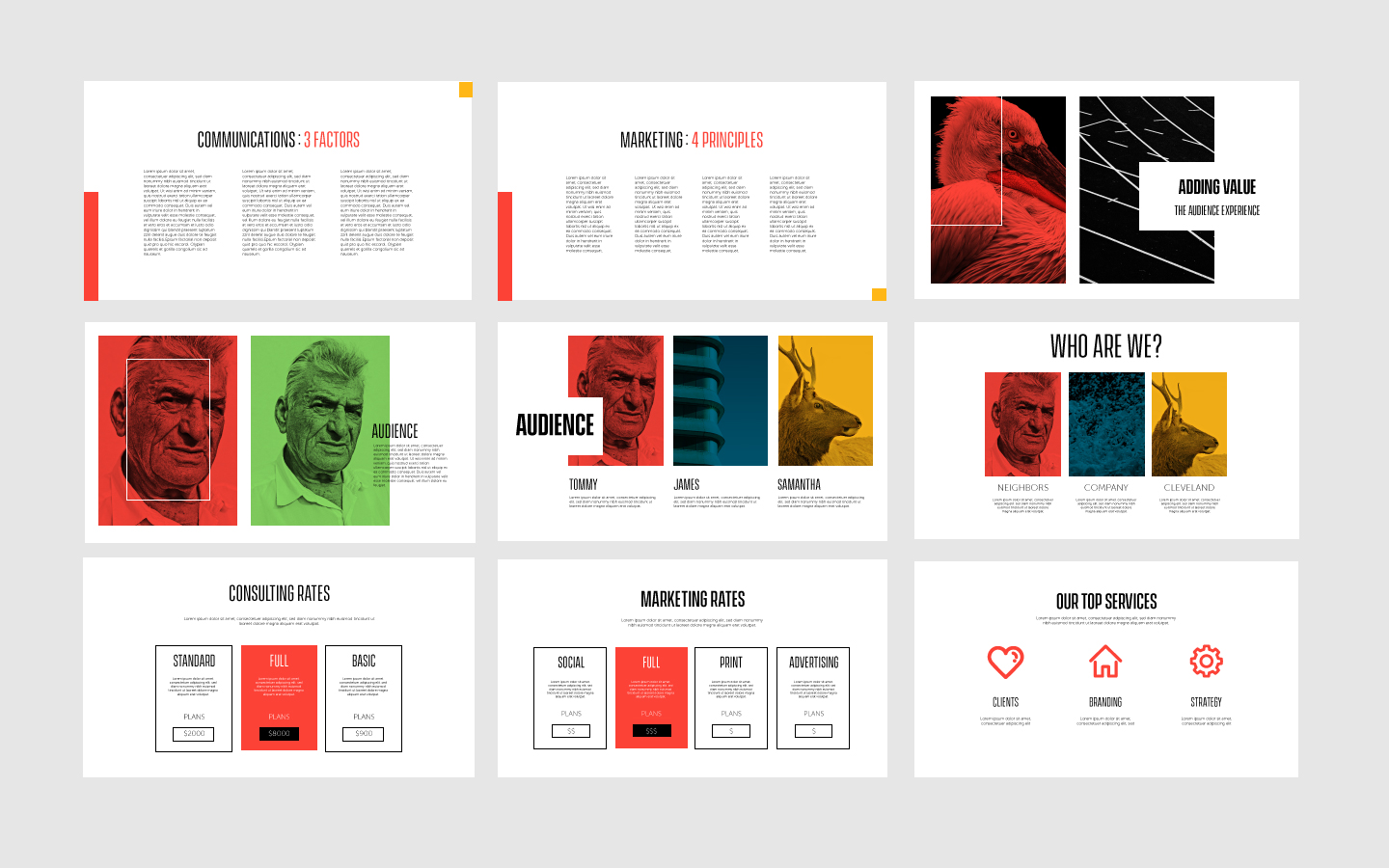
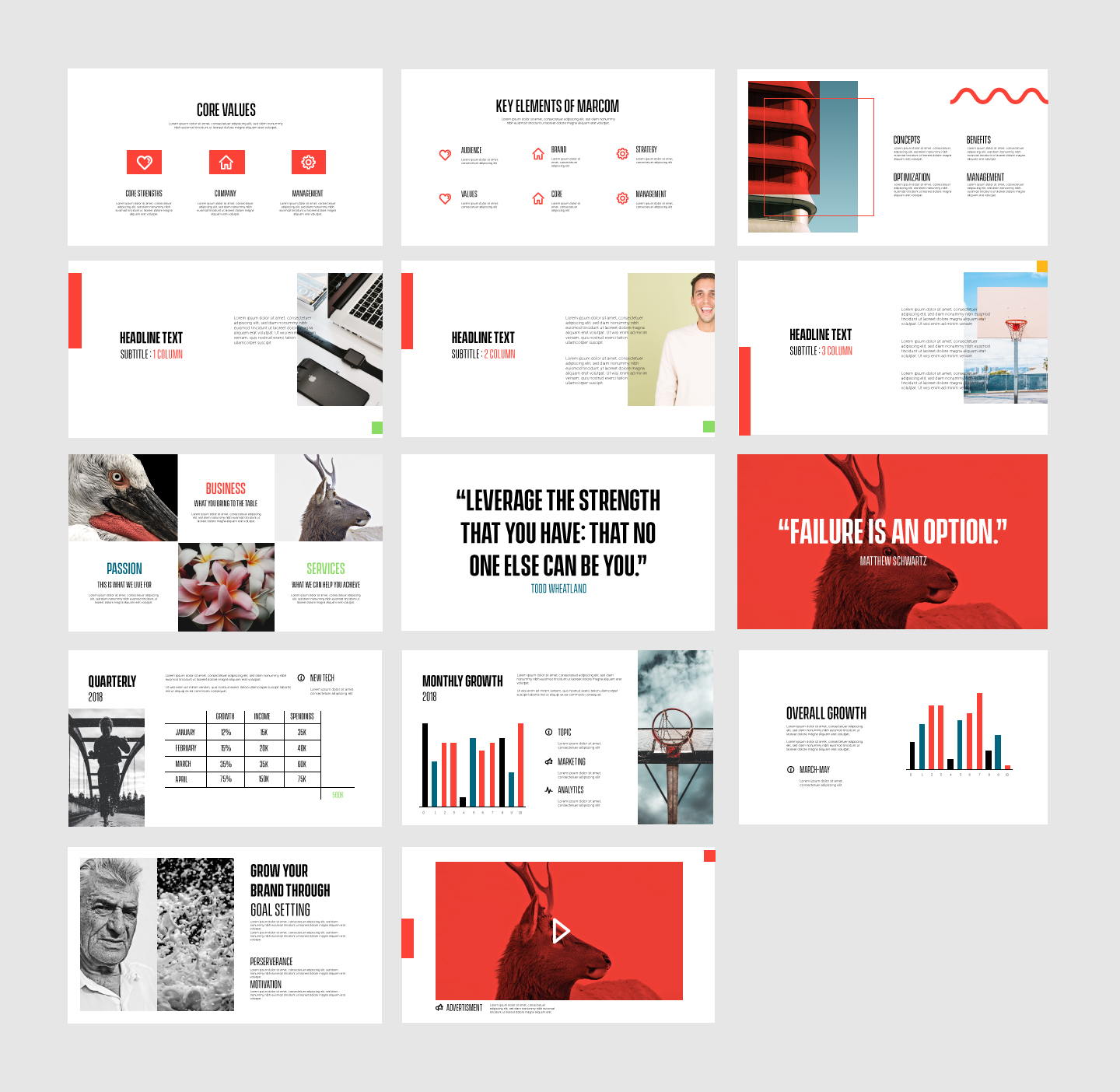
BRANDED POWERPOINT
Queen City wanted a simple branded powerpoint template that had the full visual effect of the brand.
I came up with 32 unique slides to highlight the different kinds of information the company needed to be able to share through presentations.
Using the brands color palette and creating single color photography made for a cohesive & bold brand presence.